


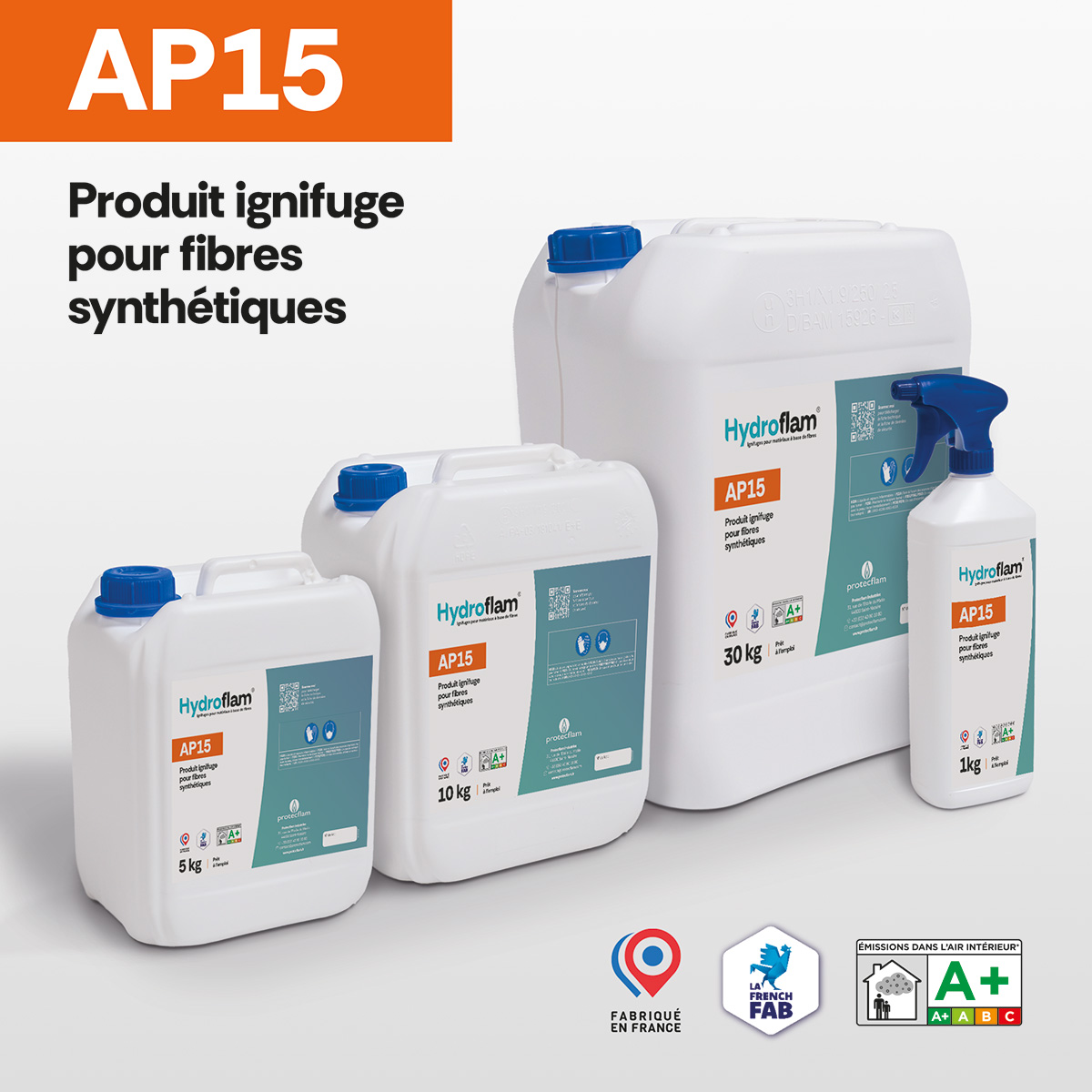
A new visual identity for a product line that is increasingly clear and modern.
Protecflam® is gradually updating the design of its product labels, with a particular focus on the Hydroflam® line .
More modern, clearer, and easier to read, these new labels have been designed to make it easier to identify products and allow for quicker access to essential information: product name, application, key features, and technical specifications.
This graphic redesign is part of a broader effort to evolve Protecflam®’s visual identity and bring greater consistency to its entire product line.
Design That Serves Information
Beyond aesthetics, this new visual identity serves a simple purpose: to make product information more accessible and immediately recognizable.
The information hierarchy, layout, and graphic elements have been redesigned to offer better visibility, both in the workshop and in the field.
The new labels will be gradually rolled out across Protecflam® products, starting notably with the Hydroflam® line .
A new identity, but the same expertise in fire protection as always.
